Headless CMS > Customize Entry List Columns
Customize Entry List Columns
Learn how to add, replace, remove, or reposition columns in the Headless CMS entry list table.
- How to add a column to the entry list table
- How to render custom cell content
- How to control column position, visibility, and sortability
- How to remove or replace an existing column
Overview
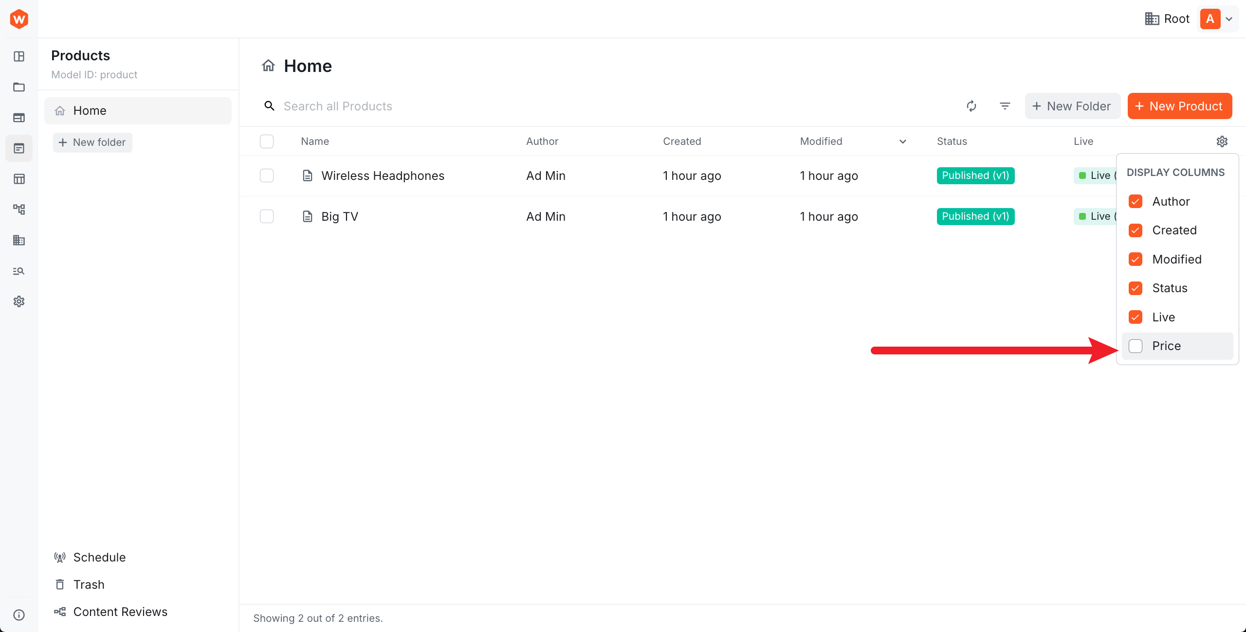
The entry list table displays entries for a given content model. By default, it shows the following columns:
- Name — the entry’s title field
- Author — the
createdByidentity - Created — the
createdOndate - Modified — the
savedOndate - Status — the status and version of the currently displayed revision
- Live — whether any revision of the entry is published; useful because the table shows the latest revision, which may be a draft while an older revision remains live
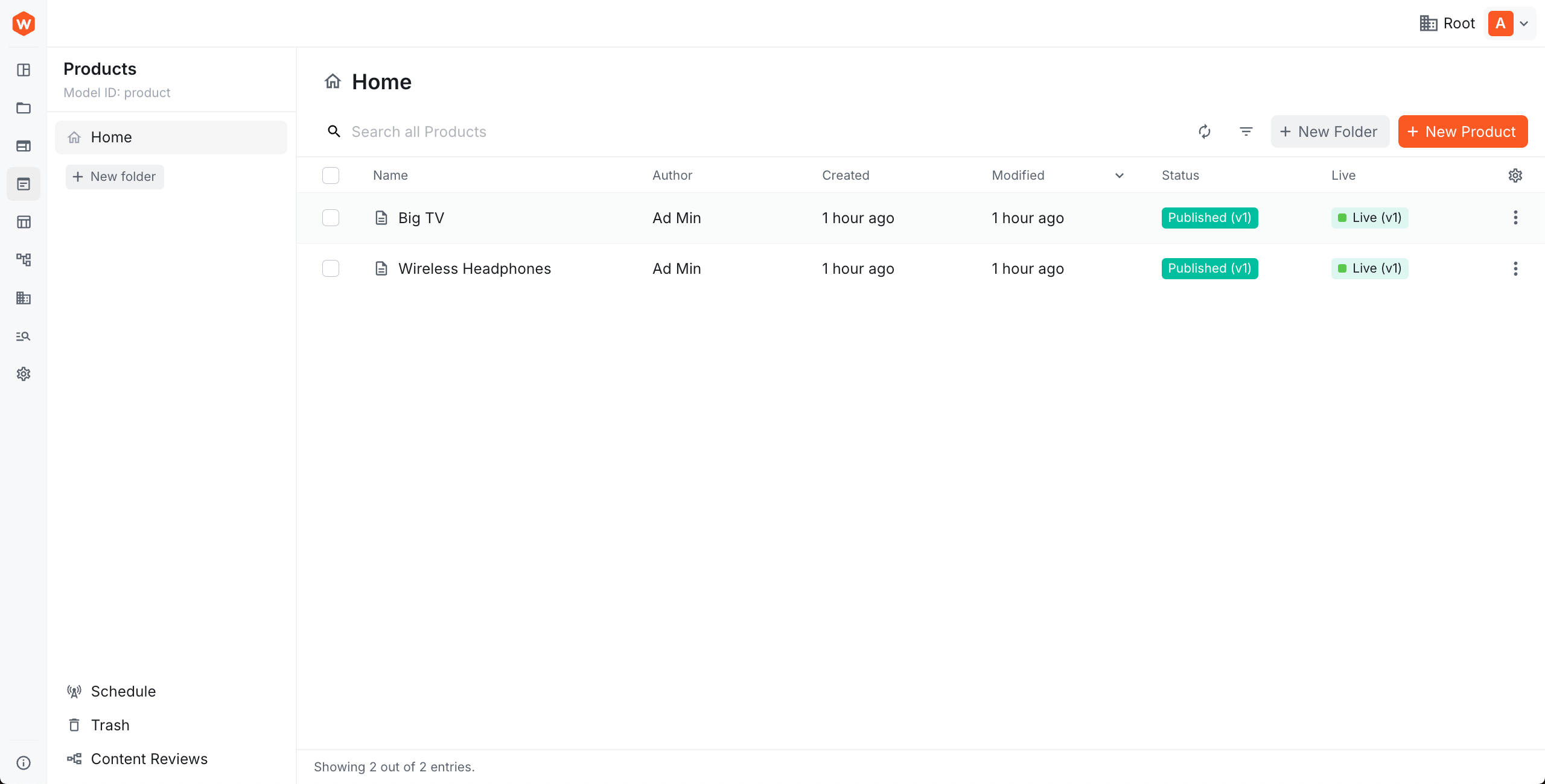 Default entry list table columns
Columns are configured using ContentEntryListConfig. You create an extension file, define your columns inside it, and register it as an Admin.Extension in webiny.config.tsx.
Add a Column
Simple Column
To add a column that displays a field value directly, use Browser.Table.Column with the name, header, and path props:
name— unique identifier for the column; also used to reference it inbefore,after, andremoveheader— column header labelpath— dot-notation path to the value in the entry data (e.g.values.sku); use this for simple fields that need no custom renderingmodelIds— restricts the column to specific content models; omit to apply to all models
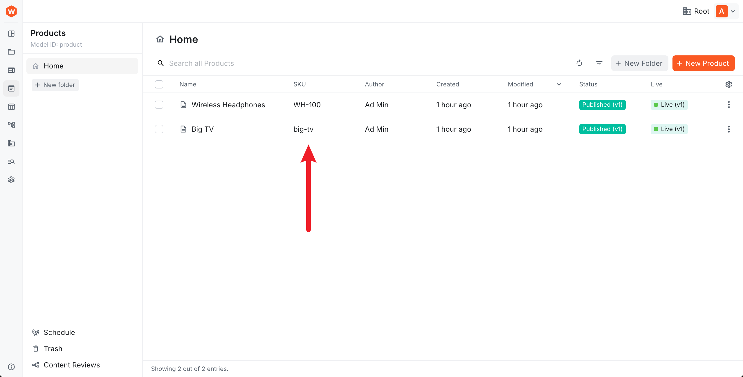 A simple custom column
Custom Cell Renderer
For more control over how a cell is displayed, pass a React component via the cell prop. The component can access the current row via useTableRow():
useTableRow<T>()— returns{ row }with the full row data; use the generic parameter to typerow.dataisFolderRow(row)— returnstruewhen the row is a folder rather than an entry; useful for rendering a fallback value
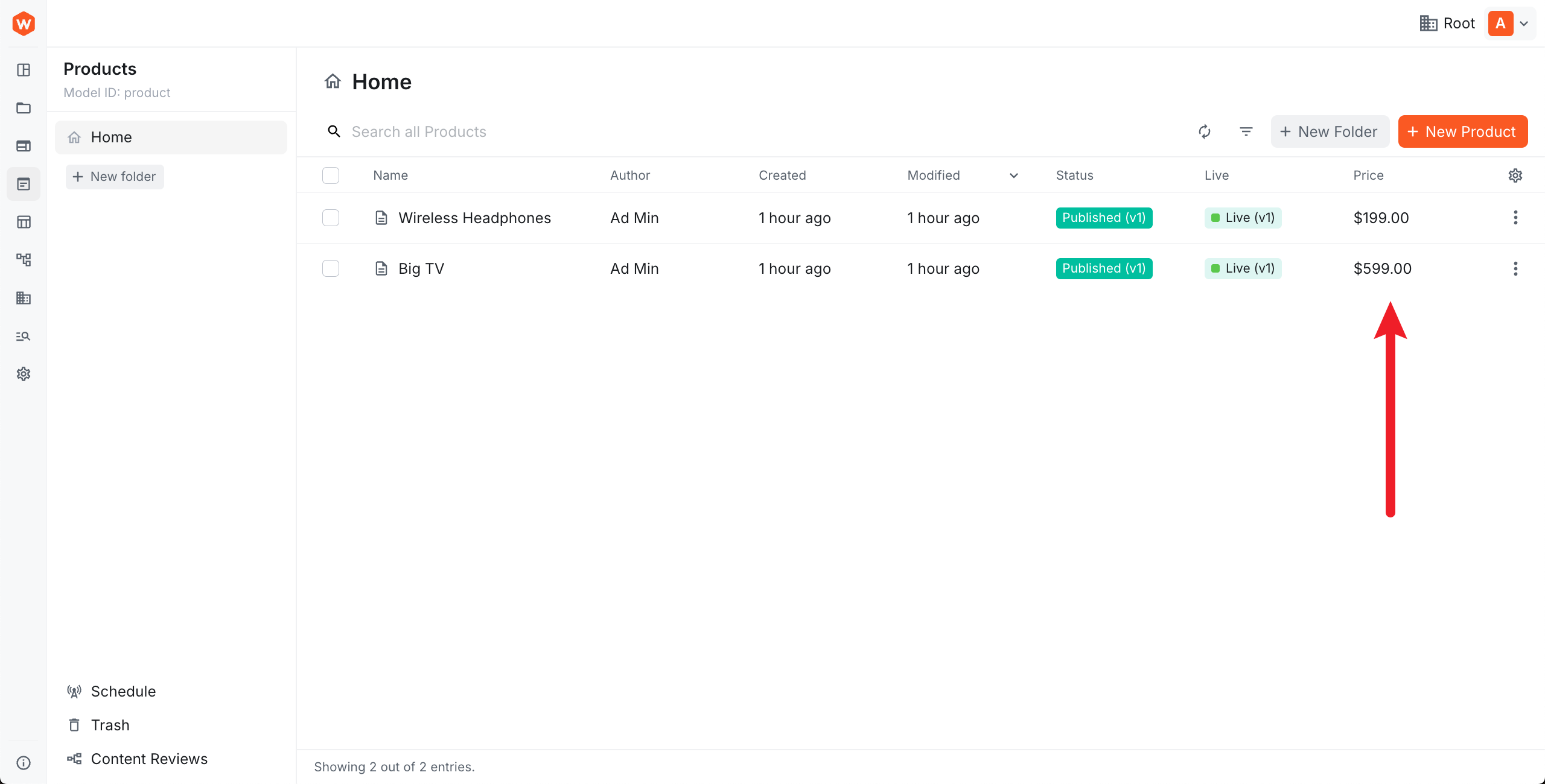 Custom cell renderer
Sortable Column
Set sortable={true} to allow users to sort by the column. The field must be included in the model’s available sorting options.
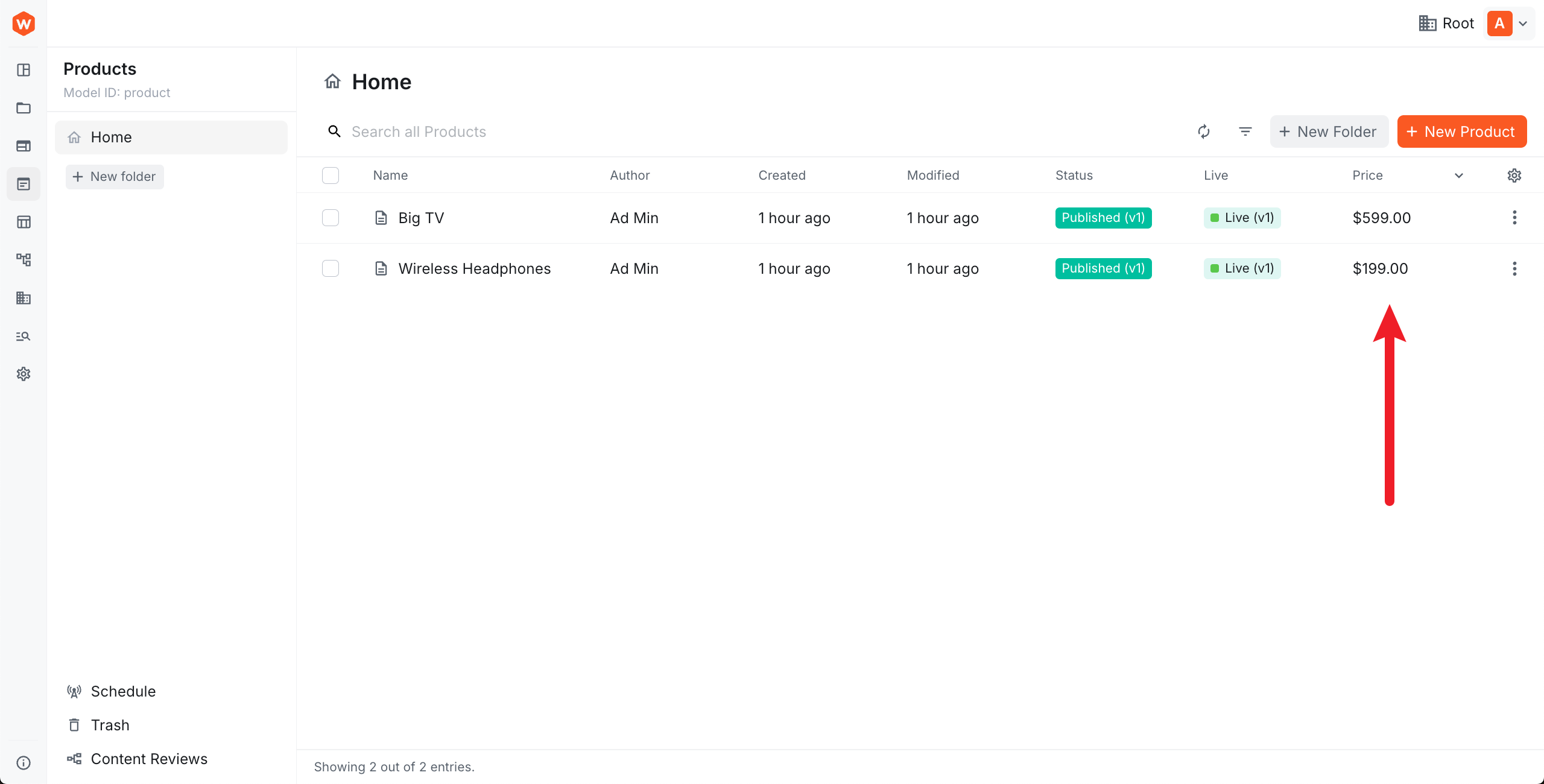 Sortable column
Column Size
Use size to control the initial column width (default: 100). The value is proportional — 200 means twice the default width. Set resizable={false} to prevent users from resizing the column.
Column Visibility
By default columns are visible. Set visible={false} to hide a column initially — users can still show it via the column settings menu.
 Hidden-by-default column
Set hideable={false} to lock a column as always-visible, preventing users from toggling it off.
Custom Class Names
Use className to apply CSS class names to both the column header and cells:
Position a Column
Use before or after to position a column relative to an existing one:
Discover Existing Column Names
To find the names of built-in columns for use with before, after, or remove, use your browser’s React DevTools and search for BaseColumns:
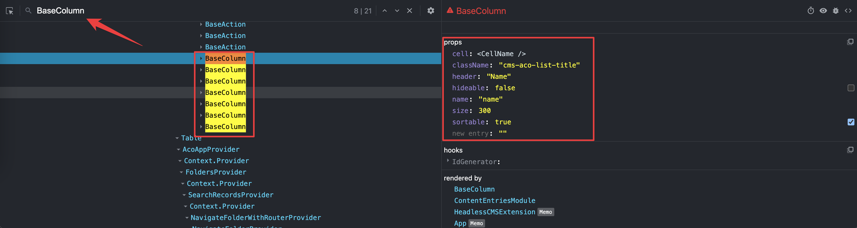 Discovering existing column names with React DevTools
Remove a Column
Pass remove to remove an existing column by name:
Replace a Column
Reference an existing column by name and pass a new cell component to replace its renderer:
Registering the Extension
Register the extension file as an Admin.Extension in webiny.config.tsx: